Friday, August 24, 2007

ITK Issues

I was having problems getting the coefficients from Linux early since the coefficients I was calculating seemed to be way off from the answers that they should have been. Initially the problem seemed to stem from Linux having problems with inverting the wavelet matrix when solving the linear system for the coefficients. But after installing the latest version of ITK on the Linux box I found that all of the previous problems disappeared and the coefficients I was getting were fine.

Since the ITK version I was using on the Linux boxes was so old it was probably causing problems in the registration program. There were also other cases when I was getting segmentation faults when using the intens_process class that could have been partly caused by the outdated libraries in ITK, VTK, and CMake.

Additional Wavelet Levels With The Ellipse

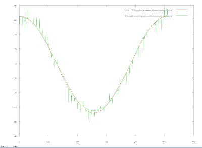
The following show the elliptical points in green with tangential noise added from negative ten to positive ten pixels with a uniform distribution. The graphs start with j = 0, and go up to j = 0,...6, with the wavelet points shown in red.


More Wavelet Levels With The Ellipse

The following is a series of images that represent the graphs of the elliptical data in green modeled by wavelets in red of varying degrees of resolution added. The first images starts with j = 0, and the last is j = 0,...6.


Wavelet Levels With The Ellipse

The following graphs show the same effects of changing the levels as the previous post. These are different in that instead of using just the x points, the whole ellipse is used. The first graph is of the ellipse in green modeled by the wavelets in red using all of the j = 0,...6, levels of resolution. Following that graph is one using just the j = 0, level of resolution and finally one where the higher resolution wavelets are filtered so that they only use ones on one side of the interval.
Another issue is still that finding the coefficients of the wavelets has proved difficult when running the wavelet program on Linux. The problem stems from the inversion of a a matrix to calculate all of the coefficients. The matrix in question is 131x512 with a rank of 131, that I convert to a 512x512 matrix by adding zeros. In windows when it inverts the matrix it probably finds the pseudo matrix so I tried the same thing in Linux by using the vnl_svd::pinverse. However, the results from using the pseudo inverse were the sae as before and Linux might have tried to use the pseudo inverse instead of trying to do the regular one when I called vnl_matrix_inverse(). Another method available was vnl_svd::solve(vnl_vector const& y) to solve a linear system, although use of this just caused a segmentation fault. To remedy the problem now I am going to finish an iterative method that uses the inner product of the point data and the wavelet functions to create the appropriate coefficients.

Wednesday, August 22, 2007

Wavelet Levels

The following image shows the x points used in the ellipse with noise added and evenly spaced intervals in green with the wavelet fit shown in red that contains all the levels j = 0,...6. Following that image is the same display except this time the wavelet fit only contains level j = 0. As it can be seen the higher levels add greater detail at a smaller scale, while the lower levels give the overall shape of the curve.
The following is the same graph as above except that wavelets of the higher levels are filtered so that only the ones that effect the right part of the function are used and thus as can be seen only the right side has the finer detail.

Representing The Ellipse Using Wavelets

The following images show the ellipse projected onto the wavelets and then projected back to see how they compare to the data. The graph shows the data in red and the wavelet version in green, and as can be seen the data and wavelets show almost the exact same locations. The first graph is the ellipse points, the second the x points, and the third the y points.
One issue that came up was that the calculations on the wavelets came up with incorrect results when I used the program on a Linux machine. The code implements classes from the VNL library like vnl/algo/vnl_matrix_inverse and vnl/vnl_matrix to complete the computations. When run on a Linux machine the results showed that the wavelets version of the data were off at the edges and when I tried to transform the y points, it gave totally incorrect results like as follows with the data in green and the wavelet fit in red.

Tuesday, August 21, 2007

Cubic B-Spline Wavelets

The above is a graph of a few of the wavelets that are being used in the levels j = 0,...,2.

Point Representation Using Wavelets

The above graph represents all the points currently used at the start of the registration process. The points create an elliptical shape. To transform the points using wavelets, the x and y values were separated as shown in the following graphs.

Then Cubic B-Spline wavelets are created with j = 0,...,6, where j is the number of intervals. Scaling functions for j = 0 where also created. Then the scaling functions and wavelets were all put into a matrix by evaluating the function along the interval at 512 points for each wavelet or scaling function and storing those values along the rows. Then that matrix was multiplied by the actual function needing to be transformed, in this case the x or y values that made up 512 points, the result was a vector of coefficients that could be used to recreate the data by multiplying the scaling and wavelet matrix by the coefficient vector. The following graphs illustrate the results where the one on the left represents the x points and the one on the right represents the projection that resulted from the data being projected onto the wavelets.
The wavelet projection produces a set of points with a similar overall shape but the y axis is more then doubled in magnitude. This might be occurring because the wavelets need to be scaled.

Wednesday, August 15, 2007

Intensity Profile Fitting Error

When fitting the intensity profile data a Gaussian and logistic function are used. To begin with the data is quickly looked at to get the initial values of the parameters. The location of the Gaussian is found by approximating the derivative at each point in the data. Using the information about the derivative the location of all the peaks in the data can be found. Then the peaks are sorted from highest to lowest and the highest one is used as the height and location of the Gaussian peak. Then the lowest intensity valued point after the Gaussian is used as the beginning of the logistic function. The height of the flat part of the logistic is found by taking the average of the last twenty points of the data. The rest of the parameters of the data are found in a similar fashion. These initial parameters are reflected in the following graph where the data is shown in blue, the Gaussian function in yellow and the logistic function in pink.
Once the initial parameters have been approximated using the previously described methods, they are optimized using the Levenberg-Marquardt algorithm using the implementation found in VNL by instantiating "vnl_levenberg_marquardt". The following graph represents the optimized parameters in the previous graph. Running the optimization widens the Gaussian, changed how steep the logistic function is, and adjusts the height of the flat part of the logistic. However, the location of the start of the logistic function and the position of the peak stays roughly the same.
In the current segmentation metric implemented in the itk::IntensityProfileMetric the each intensity profile is modeled and the location in between the Gaussian peak and the start of the logistic function,the brain-skull interface, is used as a reference to tell how far off the current intensity profile is from its optimal location. This means that optimizing the parameters does not have a huge impact on the information that is finally extracted from the intensity profiles. Therefore, when the fitting function gives a least-squares error to the fit, it does not strongly correlate to how confident the location of the brain-skull interface was approximated. Another issue that has an impact on the error is the area of the flat part of the Gaussian, which represents all of the folds in the brain matter. This area contributes a great deal to the error in the resulting fit. But the contribution to the error from this area can be misleading since if the brain matter is very stable the error will be lower although the other parameters could still be off by a significant amount. So the use of error could be factored into the segmentation process, but can produce incorrect information as shown Gaussian Scaled Metric post, where when the error was weighted the same amount as the difference in location of the brain-skull interface. What the first plot in that post illustrates is that once the error is factored in, the metric doesn't converge to an optimal value anymore, but instead creates a situation where the metric becomes very uniform and gradient decent will not be able to converge to an optimal solution.

Thus the use of error to weight the effects of each of the intensity profiles could be very deceiving in the final metric value and a method that looks at a neighborhood of the difference in location of the brain-skull interface of the intensity profile in question would be a more suitable alternative.

Friday, August 10, 2007

Different Metric Mappings

The following plots show different ways that I mapped the metric into different mathematical functions. This was done by mapping all the metric values for a square surrounding the center of the brain MRI image to statistical function. The first is a Gaussian with narrow standard deviation.
The second is a Gaussian with a wider standard deviation. Just the first half of a Gaussian was used so the left hand tail up to the peak, meaning is the standard deviation is wider then there is less of a peak and therefore a greater range of mapped values for metric results with low values. Also, a lower metric value is better and means the ellipse has a better fit onto the skull.
The final plot is a mapping to a Sigmoid function that grows very steeply.

Thursday, August 09, 2007

Gaussian Scaled Metric Value

The above visualization shows the same representation of the metric and coordinates on the brain slice image as the last post, but this time the metric value has been scaled. It was scaled by taking the metric value measured the difference between the brain-skull interface point on a sampled intensity profile compared with the optimal value for that point and scaling it to s Gaussian or normal curve. The same this was done to the fit of each of the intensity profiles and then the two values were added up to create the final metric. The results of this seem to show that the addition of emphasizing the error into each metric value seems to through off the metric and in this particular example it's hard to find where the optimal location of the metric would be located.The above image is just the weighted difference part of the metric excluding the error resulting from the fit to each of the intensity profiles. The way that the bottom of the distribution seems to be all around the same level could be due to crowding happening on the tail end of the normal distribution that it is being mapped to.

Wednesday, August 08, 2007

Metric Values Around Center

The following is a visualization of metric values around the center of the MRI brain slice. The location of the yellow dots on the plane parallel to the brain slice represents the two dimensional coordinates of the center of the ellipse with respect to the slice. The value that the points take in the z-direction or the direction normal to the brain slice represents the metric value that each location takes. In this case a lower metric value, meaning a point that has a distance closer to the brain slice in the normal direction is better and means that the ellipse is closer to the optimal location. This visualization is a square of locations with width of sixty pixels centered at the center of the image. It shows a gradual slope in towards a low metric value as the locations become closer to the center.

Uniform Distribution In MCMC

The following results illustrate the MCMC simulation results using a uniform distribution as the proposal distribution with first a standard deviation of one followed by one using a standard deviation of two.

MCMC Using VNL Random Generator

I changed the MCMC simulation to use the built in VNL numerics library that comes with ITK and VTK and made it so that I sampled from Gaussian distributions by using the normal() function available. This seemed to improve the results if I stuck with the standard deviation of one. Otherwise with a standard deviation of .5 the results seemed to still be off. The following is the results of using a .5 standard deviation of the Gaussians followed by one using a standard deviation of one.When making the registration work to run on Fedora I needed to change the way the intensity profiles are transfered into the metric class. Before it was passing a pointer to an array that held all of the intensities. This was causing a segmentation fault so to remedy this I needed to pass it my one array to write to. Another issue came about because of the GUI. In Fedora the size of the GUI needed to be increased to make sure that everything could be displayed. If the size was too small the resulting image showed nothing but a blank color.

Tuesday, August 07, 2007

More MCMC Results

The following images were created using the MCMC method previously described with the addition of a method to check for convergence so that the algorithm will stop after a certain number of iterations. The method is to take a window for the last few iterations and in that window calculate the means and variations for each of the iterations. Then calculate the variance for those means and variations and when they go below a certain point to stop the segmentation process. The first image was found using a standard deviation of .5 for the Gaussian sampling scheme and the second with 1. They show the most likely location to be northwest of the correct location, which could be explained by that area having a local maximum or the fit to the intensity profiles being off.

Friday, August 03, 2007

Intensity Profile GUI Additions And MCMC Results

To delineate where exactly the intensities are being taken from mesh I colored the graph to make it easier to see. The red and blue colors of the graph correspond to the red and blue parts of the normal lines emanating from the ellipse. There is also a blue line on the graph that represents where the mesh is located in between the two normals. The following is a still of the GUI in action.The following are the previous MCMC results with the ellipse coloring trying to follow the same coloring as the squares although for some reason when points are used instead of faces in a vtkPolyData the coloring for the opacity doesn't work as when. But it shows a distribution that follows the squares and points better.

MCMC Results

Using the new intens_process class the following represents running the Markov Chain Monte Carlo for 2000 iterations. The yellow dots represents the centers of the red ellipses that are colored according to their likelihood with darker ones being more probable. There are also red squares that are places on top of the points that are colored the same way as the ellipses and represent the probability of the region they cover. These results show a mean that is very close to the actual one but at this point I haven't implemented a way to stop the simulation in a formal manner so more iterations may have changed the result.Another result of the new intens_process is that the intensity profile fits on the top and bottom of the skull have improved and now are as good as the sides. This is shown in the following images with the arrows colored red being the ones with a very high error in their fit to the intensity profile data. There is still one issue with the fit because of regions near the top left and right where the skull boundary has a thicker boundary and also lighter in comparison to the brain matter. Because of this the fit will sometimes pick a peak within the brain matter because the highest intensity value is in that area. I am still trying to find an appropriate algorithm to remedy this matter.

Thursday, August 02, 2007

Intensity Profile GUI

Some of the results that came up from using the MCMC on the final segmentation seemed to be inconsistent with what the correct location of the ellipse should have been. So I took a closer look at what the intens_process class was grabbing from the image by using the intensity profile GUI. To make the GUI a little more clearer I added the slice being looked at in the image to the background and then added lines that represent the normals going inside the mesh with light blue, and the normal lines going outside the mesh with red. Another issue that came up was that the intensities were being sampled by taking the paths of normals arising from the points in the mesh, not the cells. So, I edited the intes_process class so that it would calculate the centers of each face of the mesh and use those points to take the data for the profiles by using normal lines emanating out from it. The only problem with having the image slice in the background is that it makes the mesh harder to see, although this problem might be alleviated by using a brighter color for the mesh or adding lines to it that emphasize its location. I also added the number of the cell into the graph title.

The results found using these changes improved the intensity profiles by having them make more sense in this context with most of the intensity profiles fitting the two Gaussian logistic model. Although having the intensity profiles sampled from the points of the mesh may not have been that big of an issue since they do coincide somewhat with the locations of the faces of the mesh.